Tuesday, November 23, 2010

Add splash to your kitchen and create flow in your home

There are some wonderful products available in the marketplace for maximizing the wow factor in every element of your home, including tiles and other materials to bring splash into your kitchen – literally, via the kitchen backsplash.

You’ll find the classic white kitchen in many home decor magazines right now (Ikea Canada’s website kitchen home page), etc., but there are other things to consider when wanting to take your likes and longevity into account.

{credit}

For example, I recently assisted a client with their almost whole-home update when they purchased a 1960s bungalow. The kitchen had been updated by a previous owner, and while the colour choices did not relate all that well to what was going on in the rest of the house, it did not make sense for my client to update the kitchen at this time.

This is a ‘before’ shot; ie. the kitchen as my clients purchased it. Notice the choice of a previous owner to install a backsplash tile that matched the floor tiles: please do not do this! Tile manufacturers may (unfortunately) make such products and present them to you in a ‘seems-like-a-good-idea’ way, but in addition to looking cheap, it’s an incredibly boring choice. You’d be better off with a 4” backsplash out of the same material as your countertop and painted drywall.


So – what to do. My clients wanted to put as little money into the kitchen as possible, since many other areas in the home were in greater need of renovating/updating. The “other things to consider” before making my recommendation were:

1) What is going on in the room itself? In this example of my client’s kitchen, I felt that using more modern or white backsplash tiles wouldn’t look right and wouldn't do anything to enhance what was already going on, ie. black granite countertops and blond maple cabinetry.


2) How does the room relate to the rest of the home, or at least the main room(s) nearest it?

In this case, the kitchen – which is adjacent to an open plan dining / living room – is visible as soon as you enter the house. The floors in the adjacent rooms are a medium brown, with more medium and dark browns being used in furniture and accessories.

And I of course took my clients’ overall tastes into consideration: while they lean towards traditional looks, they like an element of funkiness and fun, and a feeling of comfort and accessibility.

Taking all of the above into consideration, I carefully selected 4 individual glass tiles from my samples supply and created a custom-blend glass backsplash tile for them.


Let's break down how the chosen tile enhances the space and creates flow:

  • the darker gold tile speaks to the cabinetry colour
  • the brown colour speaks to the flooring in the rooms adjacent to the kitchen
  • the copper colour complements the black granite and blond maple, while adding some punch ‘n panache (it also very much speaks to the funky styling of the female home owner -- she sports a leopard print coat and fabulous orange handbag!)
  • and lastly, the light gold colour provides light, neutral spots for the eye to rest (and allows the other colours to stand out)

I enhanced the ‘pop’ of the copper colour with new pendant lighting over the peninsula (almost an animal print, yes?), and new, unique kitchen stools that have ‘hammered’ copper-looking backs and very funky styling in their curvilinear lines. Just wait ‘til the Tobacco-coloured Levelor natural woven blinds are in – they are going to absolutely pull the whole look together and this kitchen will have gone from ho-hum to drum-drum! (that’s drum roll ...)


These are a picture of Levelor’s natural woven shades from their website.
(Stay tuned for ‘after’ pictures of my client’s home when finished – coming soon! )

I will admit that there were a few nay-sayers when this backsplash tile arrived ... I will concede that it’s different and not the kind of thing you’re going to see in the latest home decor mag, but all – and I do mean ALL – the naysayers were converted after it was installed.

What you can’t see too well in the pictures is that there is a sort of ‘mottled’ texture under the glass; it gives an almost ‘leather’ affect to the tile. I’ve tried to capture it in the below picture.


It also has a beautiful shimmer overlay to it all – making it really glisten in the light (and who doesn’t love a backsplash that sparkles?!).

Above all, this new backsplash has the starring role in a 'crew of items' that are bringing wow into this previously bland kitchen. It highly complements what is going on in the room, ties in what is going on in main living areas near it (creating that flow we want), and it emphatically reflects the personal style and tastes of its homeowners.

That’s what I call success with a splash!

Liz

http://www.elizabethrobertsdesign.ca/

Friday, November 5, 2010

Design Challenge: finding common ground when you and your partner have different visions / tastes

I know a couple who did literally divorce after they built a house together. There’s something about the amount of money we spend and the feeling of ‘permanence’ when it comes to renovating or building a new home that gets to us at the core ... we feel like we have only one chance to get it right, and the last thing we want to do with that chance is compromise on our vision and what we want!


[credit: http://www.suite101.com/]

All diplomacy aside, some peoples' taste is really ... not great. Or they’re stuck back in an era that perhaps brings fond memories, but they want to implement that reminiscent decor in a way that is not appealing.

{this is not appealing, in my opinion}

[credit here-on down: http://www.csnstores.com/]

Whether your partner falls into the ‘design-challenged’ camp, or whether you both have great taste and a good eye but simply have widely differing visions for your space, here’s some suggestions for working towards that common ground so that you don’t have the task of re-building your relationship once all the renos are done:

- Make a commitment to each other to keep communications between you respectful. This will take effort on your part to breathe, stay calm, and be willing to ... (see next point)

- Listen. It can be very hard to stop and listen to someone else’s view point when our paradigm is that they are simply wrong / what they want is not the way to go (for all the valid reasons you have ...).

If you can agree to embrace the next point, listening to your partner – I mean really hearing them and not just waiting for them to finish so you can impart your view – will go a long way to each of you feeling respected and validated.

(Because not feeling seen or heard for who we truly are – and accepted – by our partners can cause us to shut down and become resentful.)

{s/he may like this, but s/he doesn't... or vice versa}


- Agree to disagree. This is cliché but the point here is to agree up front that no one and no one’s ideas are bad or wrong. If you can agree that what’s going on is you each have very different ideas and preferences, it ensures no one feels ‘put down’ which again can lead to resentment.

- Be open to new ideas. Maybe you will never be swayed into what your partner wants, but make a pact with yourself to be open to other ideas.

Step back from the colour scheme and/or specific finishings you absolutely insist are “it” and go back to basics: what is the look and feel you want to have (modern, traditional, ethnic, ‘west coast’, calming, energizing, crisp, soft/romantic, etc.).

{it doesn't get more basic than this}

- Commit to being open to consider different ways that would give you the look you want. Find the common grounds and be willing to compromise.

The notion of the latter can produce an immediate “no way!” reaction, but I’m not suggesting that compromising means you give up what you want and implement your partner’s vision.

(And please don’t compromise with the ‘I get the kitchen and s/he gets the livingroom’ method – the best designed homes flow well from room to room [which does not mean they have to all look the same].)

{maybe she wants this...}

Compromising, when there are widely different tastes, means finding an option that you would both be happy with – to do that, start by discovering and writing down what your common grounds are (see below example).

- Consider working with a designer – one who listens well and who has good mediation skills, in addition to great design skills and creativity.

{and he wants this...}

Design example:

- She wants a light, bright and luxurious-feeling bedroom and ensuite bathroom; one where she can feel pampered by her surroundings, to truly relax and rejuvenate after a long day (she envisions lots of white and water-y blue with silver accents).

- He wants dark and dramatic; one where he can feel sensual and funky (he envisions bordeaux, espresso and black with gold accents).

One common ground is they both want an ‘on-trend’ look – not contemporary, but ‘now’. Another common ground is that they agree the design should consider possible re-sale of the home in 5-7 years.

Working with the above scenario, I would suggest:

- For the bedroom, paint walls an oatmeal/sand off-white; do a feature wall behind the bed, using wallpaper with a backdrop colour that is the same off-white as the paint colour, and has a black damask pattern (you would select the paper first, and then match the paint).

Use both black and white furniture, and accessorize with watermelon, turquoise and a bit of chocolate brown. {Floors in an espresso wood finish would complement well.}

This would produce a look that feels modern and rejuvenating (because of its freshness), while funky because of the creative use of colour and the stunning wallpaper.

{this is an example of the overall look only; not exact re: colours}

[credit most pictures in this post: www.csnstores.com]

- For the bathroom, use the same colour scheme, but don’t repeat the damask wallpaper (you could do a chair rail around the room, paint the lower portion a light turquoise and wallpaper the upper portion with a patterned paper that brings the off-white, turquoise and watermelon scheme into the room).

Bring the black & white palette into the floor and shower tiles, and use black accessories.

Use brushed silver or nickel for the fixtures – they’re a better bet keeping re-sale in mind, and more subtle than shiny chrome.

Above all – do not give up on trying to find a common ground, and certainly do not give up on your relationship. You’re living with the person you are presumably because you love them. Nothing is more important than that.

Liz

http://www.elizabethrobertsdesign.ca/

Monday, September 6, 2010

Design decisions: what to do with that old fireplace

A client I’m working with recently took possession of a 1960s bungalow which boasts a retro peaked roof and other ‘flavours’ of the era. Retro can be cool, but sometimes it’s … just out-dated.

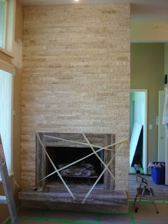
The fireplace in their home was one such item – a man-made, painted ‘brick look’ fireplace that had the added bonus (not) of a tall vertical inset of tiles up the centre of the column.


My first instinct was to simply re-clad all sides of the column in a ledgestone. But we had to go through all the options to ensure the homeowner felt this was the best option.

My client really wanted to drywall over it – think impressive mantle with lovely mirror or artwork above it. But sometimes when you see something you love in a magazine, it doesn’t necessarily mean that you can achieve that same look: you have to think about the ‘bones’ you have to work with.

In their case, this fireplace has a limited width wall, and a ‘floating’ hearth and fireplace opening that are both up off the floor. It wouldn’t look right to add even a floating mantle without either demo’ing the hearth, or building it out down to the floor, and the latter would be very heavy-looking for the width of the fireplace.

(And if you did demo the hearth, the proportions still would not be right in terms of the placement of the fireplace opening.)

Filling in the ‘brick’-work with plaster and painting it, and then simply updating the materials on the hearth and centre vertical inset were also considered. This absolutely would have been an improvement.

In the end we decided, that for the labour and materials still involved in the above option, to go all the way and re-clad the entire column (all 3 sides) in a ledgestone, with a travertine stone to replace what was on the hearth.

I also suggested that they border the fireplace opening with the material used for the hearth, to tie it together and also to attempt to bring down the height of the fireplace. (In this case, a 6” border on either side with an 8” border on the top were perfect – always make the top border a little thicker than the sides; it’s otherwise one of those things that looks ‘wrong’ but you can’t quite put your finger on why.)

The end result is a stunning, rich-looking, updated fireplace that made even the male owner (who had officially declared previously that he didn’t care about style) exclaim “I love it!” when he walked into the house. {The whole house is still in progress, so stay tuned for pictures when it's all done!}


So, remember that while there are technically many things you can do to update a fireplace, you need to take the ‘bones’ of your situation into account to ensure the best end result.

Liz
http://www.elizabethrobertsdesign.ca/

Tuesday, August 31, 2010

Design Challenge: how to handle differing wall heights in the same room

A client I’m working with recently purchased a 1960s bungalow home whose fun architecture boasts a very peaked roof that slants down to normal height (which means 12’ high walls near the middle of the house and 8’ walls on the sides of the house [which almost look 7.5’ H because of bulk-heads]).

When considering furniture and layout in a single room with differing wall heights, you’ll want to be sure that you give good thought to scale and proportion – ie. aim to elongate the short wall and bring the tall wall down.

Using the example of these wall heights in a room to be used as a home office, some specific ideas include:


• Keep any furniture against the lower-height wall in shorter proportions. For example, unless you want to make the shorter wall an entire wall of shelving (which would give a ‘library’ feel), don’t put full height bookshelves against that wall.

Keep the look more light and airy – perhaps a daybed or chaise jutting out from the corner* with a plant behind, and small-scale art hung vertically on the wall beside. That would create an inviting area without it having a closed-in feeling.

* - jutting out into the room as opposed to being against the wall so as to create the illusion of more space; add a small round table beside the chaise and you’ve got a great place for your afternoon or evening refreshment & rest

** Stay tuned for pictures – the space is still in progress with reno’s

• For the tall wall, here are a couple of ideas to bring the height down:

o Horizontal stripes: choose 3 paint colours that accent your overall room decor (and of course, flow with your home through-out).

One of these colours does need to be on all the other walls in the room. Then paint the three colours onto the tall wall in an attractive horizontal striping pattern.

Take the total wall height in inches, divide by 6 and then create a well proportioned patterning within that.

For example, a 12’ high wall = 144”, divided by 6 = 24”. So, we’d create a pattern for 24”: the first colour could be a 12” high stripe, then a 3” stripe, then an 6”, then a 3”, then repeat.

If my colours were banana yellow, swimming pool blue and frosty white, I would do the 12” stripe in the yellow, the 3” stripes in the white, and the 6” stripes in the blue. It would be a stand-out feature wall and the horizontal stripes would draw the eye down.

o For a less labour-intensive way to draw the eye down (or if stripes aren’t your thing), you essentially want to fill up that wall space, without getting ridiculous about it.

For example, don’t put a desk with a hutch on it that totals 5’ in height against the wall and then a couple of small pictures above it. That would leave a lot of wall space above the art and even if the desk were well proportioned with the wall’s horizontal measurement (which is also paramount against such a tall wall), the scale of it wouldn’t look right.

Instead add 1 or 2 larger pieces of art or 2 or 3 medium sized pieces of art; they just need to be proportioned and hung well in relation to the desk. ie. the reach of the art, horizontally, should either exceed the length of the desk or be narrower than it (exceeding it would be optimal in this example).

While adding a chair rail and then using paint and/or wallpaper below and/or above the rail is a great way to draw the eye down if all the walls in a room are tall, I don’t recommend that when you have differing wall heights in the same room.

However, picture rails would work – you could use more than one if the space warrants, just be sure to position the first one at the height of the shortest wall in the room. (In that case, you should vary the sizes of the pictures on the rail – but be sure to keep the majority of them on the larger scale; rails full of small pictures would accentuate the height of the wall.)


Liz
http://www.elizabethrobertsdesign.ca/

Friday, August 20, 2010

Where to Splurge vs. Where to Save I

I love the “high/low” comparisons produced by Style at Home (Canadian magazine – see www.styleathome.com) – they are a testament to how it is possible to achieve a high-end look at a much lower price.

When it comes to renovations in your home and you’re faced with the almost impossible task of trying to achieve your desired look without dangerously exceeding your budget, here are some suggestions on where to splurge vs. where to save when it comes to plumbing fixtures.

I believe, as with almost everything, you get what you pay for (I say almost because there are items / products out there where you get a lot of value for the price being asked).


Plumbing fixtures provide a very basic – but critical – function in our home. Yes there are fixtures that also provide a lot of bells and whistles, but leaving the body jet-spraying shower etc. fixtures aside, make sure you have quality fixtures in these key areas:

• Kitchen sink: enamel on cast iron, porcelain and granite sinks take you into a completely different price point, so let’s just talk stainless here: there are varying grades of stainless steel (“SS”), so if you are installing a SS sink, don’t buy the cheapest on the market.


Research the brand (find out the nickel content) and ask the retailer how the sink will stand up to scratches and staining. Nothing looks worse in the family and social ‘hub’ of your home than a SS sink that looks scratched to (you know what) and is uneven in colour tone (or faded looking).

The best brands of course are Kohler, Franke and Blanco. But you don’t have to break the banco with one of their sinks – yes, it is possible to, but you can select one on the lower end of their price spectrums.

• Kitchen faucet: ditto. The range in pricing in plumbing fixtures in general is huge – you can buy a faucet for less than $100 or buy one for more than $1,000.


But don’t spend less than $250-300 on your kitchen faucet – the money you save initially will be spent later in frustration and then eventual repairs and/or replacement.

Delta and Moen make beautiful fixtures in a ‘mid-price point range’, as does Kohler. Friends of mine spent $100 on a new kitchen faucet – the kind where you can pull the sprayer out of the tap and put it back in. They had to wrestle to get it back in from the get-go, and after 2 years, it won’t go back in at all and now hangs unattractively from the tap 24/7.

I spent $300 on the Delta Allora which has magnetic strips to keep the sprayer tightly snuggled in the faucet – it’s easy to take out, a snap to put back, and after 2 years, it looks as good as the day it went in.

So – where to save in the kitchen then? Cabinetry is a good place to start. Ikea and other cabinet makers using mdf can make great looking cabinets that do stand up to wear and tear relatively, for the price point. And with your sparkling stainless steel sink and beautiful faucet(s), it will look very much like a high-end kitchen.

• Powder room: I find pedestal sinks in a main bathroom unpractical (although gorgeous), but they are perfect for a powder room where its function is to simply wash up after using the lavatory.


If you want to install a pedestal sink in a powder room, just make sure that the scale of the sink is in keeping both with the room size and the general ‘stature’ of the house.

Examples: American Standard makes some attractively-shaped pedestal sinks at very reasonable prices, and given the right room / situation, I would consider installing one of them – perhaps in a basement bathroom in an older home, if the bathroom was small and maybe even lower ceiling height.


I say that because the scale of the American Standard pedestal sinks is small. It wouldn’t look right or ‘do justice’, for example, in a powder room on a main living level where architectural enhancements such as mouldings and a higher ceiling command a more ‘substantial’-looking sink.

Yes, a Kohler pedestal sink is almost 4-5x the price of an American Standard one, but don’t save here if your room/architectural details command more – choose less expensive floor tiles instead and install them in a more creative pattern (eg. diagonally or accents in the pattern).


You can also save on the mirror and lighting in this example, because those are items you’ll be able to get good bang for your buck on – and, they’ll look even better when installed with your fabulous, correctly-scaled and appropriately-‘statured’ pedestal sink.

Liz
http://www.elizabethrobertsdesign.ca/

Thursday, July 29, 2010

Let's Get Practical I

How do they get those beds to look so beautiful in the magazines??!

Well, for starters, they iron the bed linens. Think spray bottle with water, can of starch, a very hot iron and a significant outpouring of energy, especially where your hand/arm is concerned ... oh, and at least 3 episodes of Grey’s stacked back-to-back as you camp out in front of the TV getting your workout in for the day.

Even all that effort above can be thwarted if you’re ultra-picky (ie. unrealistic).


Note that before the photographer arrives for magazine shoots, they are tucking/pinning where needed to create the sharpest of a crisp-linens look.

So, what are us ‘normal’ people to do? The above, combined with the often desired look of having many decorative pillows on the perfectly made bed to help pull the room together, is the perfectionist’s partner’s nightmare.

Some people (gasp) don’t even make their bed after crawling out of it in the morning. (You’re going to be out all day and not looking at it until you crawl back into it that night anyway, right?)


These practical tips are not only for people that do make their bed every day, but for those who only make it when they’re having company (and in that case they too want their room to look well-designed):

• Launder your bedding regularly. Once/week+ if you’re a sweat-er or the oily type; once/10 days-2 weeks if you’re the type that holds all your toxins inside. Nothing makes a home or the items in it look older and worn faster than letting dirt (and in the case of bedding, smell) build up.

I dry my bed linens on a low temp for just 15-20 min. to take some of the wrinkles out, and then hang to dry the remaining time if it’s nice out.


If that’s not an option for you, dry on a low temp until dry – this will help to prevent shrinkage. And use all-natural detergents; the chemicals in other detergents wear the fabric and fade the colours [even the ones that say they are designed to do the opposite]. {Use a small amount of bleach only if you have to, and only with white linens.}

• Iron just the top 12-14” of the top sheet only; the rest of the bed can easily be covered with your duvet / blankets and pillows, so why exert more energy than you have to?

• Iron just the ‘showing’ side of your pillow cases. And after you’ve laundered your duvet, iron just the showing side while it’s on the bed. Use an extension cord so you can move around the whole bed easily.

I can do our king size duvet in 10 min., so this is not an onerous task unless you are a perfectionist (think 70/30, not 100%).


In that case, remember that you are the only one who sees the granular stuff: look at your bed from a 5 ft. distance, and if the overall look feels polished and pulled together, your guests will never notice the “30%”.

• Now for those decorative pillows: what to do with them when they’re not sitting pretty on the bed?


If you’re lucky enough to have the room for attractive storage that can accommodate them nearby (eg. a storage bench at the end of a bed or nearby cupboard or built-in where you can spare the space) – you’re golden.

If space is at a premium for you though, and you don’t like the “just throw them on the floor” option [I am kidding], get an oversized clear* plastic bag (the kind used for yard trimmings work well), place the pillows inside and then place the bag** under your bed or essentially whereever you can fit the bag nearby.


The plastic will help to keep the dust off no matter where you decide to store it (even if just overnight you are simply putting them in a corner of the room). And, hey, if you don’t have time to make your bed the next morning, at least your floor won’t look cluttered with your pillows all over it! ; )

* -- A clear plastic is suggested as it’s at least more attractive to have a bag in your room with pretty pillows shining through than, say, a dark green garbage bag.

** -- If you have more than one large plastic bag of decorative pillows, you may want to check out my “less is more” blog post ... Seriously – more isn’t always better; you can still create layers by using pillows with varying shapes, or add a throw. Remember that “function” is the most important element of the best design.


Liz
http://www.elizabethrobertsdesign.ca/

When a good thing is too much ... Or, less is more.

There are enough design “do’s” and “don’ts” out there to make ones head spin ... you’ve got a lot to think about if you want to achieve good design in your home.

There’s the basic key elements of design, the key principles of design, and then when it comes to implementing, it gets more granular: from ‘rules’ for selecting the right paint colour for your home to all the things you should keep in mind when selecting furniture and designing layout. And let’s not talk about lighting (not now anyway...).

Is all this design “advice” too much of a good thing? Can you ever ‘throw it out the window’ and just do what you appeals to your visual senses or what’s going to work the best functionally for you/your family?


I’ve read in many design magazines that if you buy what you love, “you can’t go wrong”. Oh yes you can.

Whether the design and decor of your home is appealing to all senses, including pleasing to the eye, is very subjective – all the rules and theory aside, ultimately it is a matter of personal taste and opinion.


How many pictures of the inside of a rich person’s home have you seen in magazines that made you wish you hadn’t had that extra helping of potato salad at dinner? Ultimately, if you love your home, that really is all that matters.

But if it also matters to you that your friends and family love your home, and that it is considered a well-designed home on a more universal level, applying the rules and principles of design along with the ‘what you love’ method is what will get you there – along with a good, design-savvy friend to help you 'edit' how much of 'what you love' is in the space.

I do personally subscribe to the “less is more” design mantra, and feel that harmony -- when it comes to a colour palette -- is best achieved with some 'neutral space' to give the eye a break.


For example, on a home design show lead by an all-male design duo (whom I do without question think are top talents), they revealed a living room/eating area/kitchen which had been re-done in a milk-chocolate brown, turquoise-y and creamy/gold colour palette.

I loved the palette but it was used so much in the space that, as it was revealed, I felt like I was walking (visualizing) into a spray-painted fairyland of sorts. That kind of design statement can yield a ‘wow’ initially and perhaps for a time, but to stand the test of time, I feel the palette would have been even more impressive if it had been used less in the space.

Think about how you feel about the ‘less is more’ mantra and what it would mean in your space -- and maybe your life, too ...

Liz
http://www.elizabethrobertsdesign.ca/