Showing posts with label interior decorating Vancouver. Show all posts

Sunday, August 26, 2012

How to choose dining room furniture: the chairs

Yes, my blog did get covered in cobwebs ... I am blowing and swatting as I write :) Perspective happens when a parent is ill and dying, and it happened to me. But I am through the worst of it now and happily feeling my creative juices flow again.

I thought I’d start with getting back to the topic I started last Fall – things to think about when you’re treating yourself/ves to new dining room furniture.
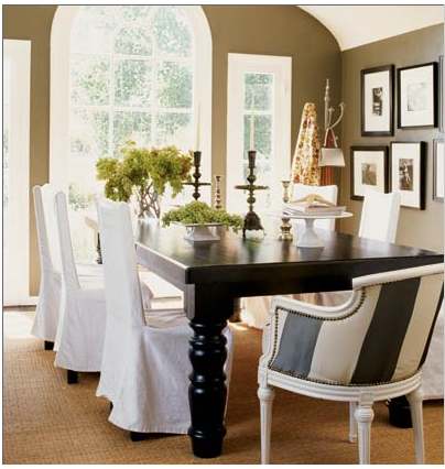

The hardest thing about interior decorating – I find – is that there are sooo many wonderful choices, it can be really hard to make a decision! If you happen to absolutely love just one look and know for sure what you’ll be happy with for years to come – consider yourself blessed.

It’s one of the reasons why most people ‘play it safe’ when buying furniture / making decisions on the pricier / fixed items in one’s home. And it can definitely be argued that if you go classic and neutral, your money is well spent with furniture that can be considered timeless.


This Palm Beach dining room by Gary McBournie is stunning, yes?!

In my post on how to choose a dining table, I advocated for not buying a "matching" dining table and chair "set". In that post, I outlined a process for selecting your table. Now some thoughts when it comes to selecting your chairs:

The first element we started with when selecting the table was the lines of the table. This of course is also important when it comes to the chairs, but you can mix and match here more easily and still have a successful look.


Ellen O’Neill

What makes the “shiny new” glossy red chairs work with the (very!) shabby end chairs in the picture above is the other red links in the space. But, I advocate another element to be your first consideration:

Is the chair comfortable?!!

While this may seem like an obvious point, it’s surprising how many people choose chairs first because of colour, 2nd because of price (or vice versa), 3rd because of how the chair fits with the overall design of their space – with comfort coming in close to last.


Suzanne Shaker

While all those other elements are also important, you want to have your meals – and you want your guests to enjoy their meals – in comfort. Can you sit comfortably for a 2-hr meal in your current chairs [even for a breakfast nook, I wouldn't want to sit in the above ones too long ...]? What about your last ones?

I’m not advocating for a sofa at your dining table (although designers are also doing that these days ...) – just don’t buy your chairs solely because they look good and you like the price, and you think you can “live with” how comfortable they don’t feel in the store ...

Spray-painting antiques / 2nd-hand store finds and adding new seat cushions is a great way to link in other design elements/colours in your space and give your dining/eating area a unique look.


Jonathan Adler

I do think you can achieve a great look if you really prefer to have one "set" of chairs around a table – as long as you do something to make the chairs more interesting.

Whether it’s as simple as the two end chairs having arms (otherwise being the same as the side chairs, like in the 2nd image above), or mixing it up with different upholstery on the back of the chairs (re: upholstered chairs).

If you like the ‘mixed chairs’ look, one way to ensure success is by having at least one element linking them – whether it’s shape / lines or a colour.


In my own space, in which I recently implemented newly-purchased dining chairs (bought the dining table 3 yr’s ago and had gotten very inexpensive ‘temporary’ chairs until we had it in our budget to get what I really wanted [I mean we ...]), I decided at the outset that I wanted the end chairs to be completely different from the side chairs.

While I did select all chairs whose legs have similar lines to them, the colour, shape and scale of the end chairs are different from the side chairs. What makes it work in the space is that each of the chairs link to other elements in the space – the end platinum-upholstered chairs work with the dove grey floors and other grey items in the open space.


Elizabeth Roberts Design

And the side white ‘animal-friendly’ leather ;) chairs link to the white stools at the island, with the espresso wood trim on the chairs directly linking to the dining table. {The end chairs were custom upholstered by local Vangogh Designs – yes, these were a splurge, but the side chairs were inexpensive making the whole set less than what we were prepared to pay. And they’re both very comfortable!}

Little side plug here: contact me if you’d like to explore Vangogh furniture options.

There is a lot more to be said, of course, on the topic of how to select dining chairs. Era of chair / style / appropriateness of chair in your space, the size of the chair(s) [think of the biggest member of your family / guests you invite over frequently], material [kid-friendly?] ...


While it can be overwhelming, start by deciding whether you want more of a “set”, or if you want (just) the two end chairs to be different, or if you want to completely mix it up. Then decide on upholstered vs. wood or a combination.

Look at images on the net and in shelter mags until you’ve got these ones figured out – starting to shop could otherwise put you in a tailspin.

It's Your Space, Your Place, Your Life -- want a great-looking space that embibes the feel you'll love living in? Contact Liz to help make it happen!

Liz

Credits

Decorpad.com
HouseBeautiful.com
   Gary McBournie
   Ellen O’Neill
   Suzanne Shaker
   Jonathan Adler
KimGray.co.za
Elizabeth Roberts Design

Sunday, October 23, 2011

How to Prioritize Your Renovation Dollars / Top-to-Bottom Re-Design

At long last, many of the decor elements of a client’s renovation I began work on last summer have now been implemented – which means there are some finished areas to reveal!

A large portion of a re-design can often take place within a few months ... but sometimes exceeded budgets on the reno side means new furniture, window coverings etc. have to wait and thus can stretch the total project into many more months – sometimes even years [after all, I can’t show you a 12-yr old couch amongst the new elements ... now can I? :) ]


My client’s - Professional Organizer, Rowena List - “Office to Dream In”
{photo by Anna Beaudry}

So – how does one go about prioritizing a top-to-bottom re-design if there simply isn’t enough money to do it all at once? Structural changes and kitchen/bathroom renos aside, here is the order I recommend spending your re-design dollars in:

1. Flooring: newly painted walls, a new layout, furniture etc. will be lost on worn or uncoordinated flooring – I say this is priority 1.

In my client’s 1960s bungalow (below), we went with a medium brown laminate in most areas (the kitchen and bathrooms were left alone). [Identifying the overall colour palette before settling on your flooring colour is key.]

{photo by Anna Beaudry}

(Re-cladding the fireplace in this project was also prioritized; big elements like that should squeeze onto the list, somewhere near the top.)
Tips:
a) don’t use laminate in an entry way in a wet climate (ie. Vancouver!) [we went with a porcelain tile above];
b) when the space is an open plan* and the entry way is a smaller area, choose a colour that most closely matches the main flooring so that the eye is tricked into seeing it all as uniform.

* Many designers recommend keeping all flooring uniform from room to room regardless of the plan (eg. hardwood throughout the entire home), but I think there are instances when different flooring for different spaces is not only appropriate, it’s more interesting. I don't disagree with the reasoning of keeping it entirely uniform, I just think the rule can be broken successfully ... with a clear and carefully chosen palette, of course.


2. Lighting: most homes of yester-year have lighting that is nothing short of terrible. Not just the fixtures themselves are outdated, but the amount of illumination per area is usually highly inadequate.

If you’re going to re-paint the interior of your home, do yourselves a favour and evaluate your lighting plan first (as walls and/or ceilings may need to be ripped open).

Consider a mixture of recessed ceiling lights, hanging ceiling lights (pendants), wall sconces, up-lighting, down-lighting, under-cabinet etc. – yes, in addition to floor, table and task lamps you may wish to use.

{photo by Anna Beaudry}

With no budget for a kitchen reno, I updated my client’s kitchen above with new animal-print inspired pendants + additional recessed lights (along with a new backsplash, tobacco woven blinds and copper-backed stools that all pull in the new colour scheme the owners love in the adjacent Great Room).


3. Doors + trimwork (eg. baseboards, mouldings etc):  Be sure to evaluate the state of the doors and trimwork inside your home; painting worn doors and trimwork only brings them back to life if they're in decent shape to begin with.
And please don’t think that painting those non-wood doors that are finished with a ‘wood grain look’ are going to do the trick – they look cheap no matter what.

Either refurbish solid wood vintage doors (check out your local salvage dealer and home demolition sales), or paint new, modern-looking doors (and if they’re not wood, don’t try to make them look like wood...).

{photo by Anna Beaudry}

In this part of my client’s Great Room above – I updated existing furniture with pops of colour, a knock-out mirror and a custom built-in cabinet that delivers on both functionality and aesthetics. There was a door where the mirror is, and instead they splurged on glass folding doors that lead out to an inviting outdoor living area.

4. Painting: Next figure out how much, what and where you’re going to paint (ceilings? walls? doors, trim ...) Are you going for a clean, neutral colour throughout the home so you can have dramatic features in areas/rooms here ‘n there?

Or are you implementing a varied palette that still flows from room to room and ties to look smashing together? Wallpaper accent or mural? Colour blocking? If you’re unsure, hire a professional colour consultant or designer that can help you get the look and feel you’ll love living in for years to come.

{photo by Anna Beaudry}

In the case of my client, she wanted a clean look that would also feel warm, inviting, casual – while still elegant, and a bit funky (and she loves earth tones, not on-trend-right-now-grey).

So I recommended a soft cream on all walls, BM Simply White on the doors, trimwork and ceilings (except the great room which has a tall slanted ceiling – in which case carrying the wall colour onto the ceiling works best).

5. Window coverings: I would rather see old furniture in a room with new window coverings than the other way around. Old furniture can be dressed up with decorative pillows, a throw, slipcover.

There’s no getting around outdated or worn window coverings – they take away the lustre of other re-design efforts in a space quickly!

In my client's master bedroom above, I added shimmer to chocolate drapes by hanging glimmering charcoal gray beads over the drapes.

{photo by Anna Beaudry}

I recommended my client prioritize the purchase of the above white dresser for their bedroom – using their existing antique teak unit would not support bringing the room up-to-date. It also supports the luxurious and inviting feel to the room sumptuously!

In terms of the remaining items “on the list” in a top-to-bottom re-design, I recommend choosing updated decor objects next if new furniture is not in the budget right away. This includes pillows, throws, area rugs and art.

Of course, the list can go on and on ... I remember my client saying to me about 2/3’s of the way through the process, “I just want to get this done”. But we would never buy three new necklaces and consider our wardrobe ‘done’ for the next 10 years ... and so it is with a well-designed home.

What’s next on your list?

It's Your Space, Your Place, Your Life:  want a great-looking space that embibes the feel you'll love living in?  Contact Liz to help make it happen!

Liz

Credits

www.ElizabethRobertsDesign.ca
annabeaudry.com
gharexpert.com
bathroomdesignideas.com

Tuesday, September 6, 2011

How to choose the right dining room furniture: the table

Buying furniture for a dining room – or main eating area, if it’s not a room per se – can be an expensive proposition, especially if you want it to look well-designed.

Every designer will tell you that the worst thing you can do is to go to a ‘box’ store and buy an entire “set” – table, chairs, buffet.  You may get quality furniture at a great price that gives you good functionality, but it will leave your space looking outdated as soon as it’s arrived.

Worse, it will create a feeling of ‘sterility’ which is not conducive to the enjoyment of food and spirit with family and friends ... It would take a LOT of dressing up to make this area inviting, no?  Yes!!
Example of what not to do

Buying the right furniture for your dining room/eating area is an expansive topic ... so much so that I’m going to break it down into separate posts; this one is going to focus on the table element.

You want to choose a table that is able to morph many looks.  While most of them can by nature, think about the “lines” that would be most associated with the type of looks you are attracted to. 

For example, if you like French country, French provincial and shabby chic looks, you wouldn’t choose a table with very rectilinear lines / hard edges; you’d want something softer, with at least some curvilinear lines.


And conversely, if you like a more modern feel – whether industrial, masculine, minimal, organic, or a bold and funky look, rectilinear lines would fit the bill.


Next think about size and scale: while functionality is paramount (ie. how many people will be eating around the table regularly), the space will look poorly designed if the size and scale are not proportionate.

If your space is smaller and you need to maximize the amount of people you can seat, you may want to opt for a round table.  With either movable chairs ...


... and/or fixed bench seating, round and oval tables can keep a small space feeling open while maximizing functionality.


To determine how large your table can be (using just movable chairs), leave 3' to 4.5’ of space around every angle of the table for chairs and traffic.  Whether your space is open or has walls, and the table/chair placement in relation to other furniture can change the required breathing space needed around the table. 

TIP:  empty the space and put masking tape on the floor to ‘draw out’ the potential size of a table. It will give you a good feel for how large a table the space can take before it feels out of proportion.  Place chairs around the imaginary table to further visualize.


Once you know the size and general lines of the table you’re after, you can start looking.  Here you will want to rule out tables that aren’t a fit with either, and also ones that don’t fit your scale.  Remember that “size” is the physical dimensions and “scale” (fm a decorating perspective) is the relative size as it relates to the size and scale of other objects and fixed elements in a room.


For example, you might love the above table and think it would look great in your 8x10 dining room as long as it’s (custom) made to fit – but the scale of this table begs for a taller ceiling, a bigger room or open space, an expansive window, etc. -- to not just look really great, but to look right.

TIP: if considering a table with the above type of ‘bench pedestal’ legs, watch where the legs are going to 'land' re: the placement of chairs around the table. Notice in the above picture how the chair on the left has to straddle the table leg. If you wanted to place a standard 6 chairs around this table, you would not be able to without the side chairs sitting very unwell!

 
Last but not least is colour.  The 2 biggest mistakes I see is people who buy their dining room table in the same wood colour as their floors and/or kitchen cabinetry.  Remember -- we want contrast for interest.

Or they go too far the other way and buy in a colour that doesn’t relate to anything at all.  While the best designed spaces have colour values in the light, medium and dark ranges, all colours in the space need to work well together.


The material with which the table is made is another important element.  Whether solid wood, wood veneer, glass-topped, etc. ...

But all of the above that I've outlined – in my opinion – trump the material.  Do your research on the material in relation to your targeted price point so that you will know good value when you see it, but if you get the lines and shape, size and scale, and colour all right, you will have chosen a strong foundation for creating a dining area that will beckon family and friends for years to come.

It's Your Space, Your Place, Your Life -- if you want a great-looking space that's right for you and embibes the feel you'll love living in, contact Liz to help make it happen!

Liz


Credits

housedesignsplan.blogspot.com
designstyleguide.net
dimensionsguide.com
decorpad.com
furniturehomedesign.com
houseandhome.com (sarah callanan)
countrylivingfurnishings.com
flairlanes.com
topdesign72.com

Sunday, July 31, 2011

How to make a glamorous drapery panel

When I designed our new-build home in '08, I decided for both space and safety reasons that I would implement a drapery panel instead of a door for the closet in our master bedroom.

Since that notion can remind some of an earlier look they may have had in their college dorm room or first basement suite rental, it's often forgotten that it can be a truly gorgeous solution that also brings personality into the space.


It's also a great space saver -- a recent client of mine did not know how she was going to get nighttables on both sides of their bed in their very small master bedroom. It had an awkward closet with a door that opened right into the space for one of the nighttables, with no possibility of orienting the bed differently.

"Remove the door?!", she exclaimed at my suggestion. We were both happy that the door could be re-purposed to properly lock off their rental suite, but even if she couldn't have used it elsewhere, I would have stuck by my recommendation.  It looks great and they have plenty of room for the nighttable and space to move around it.

Drapes are also a great way to create closet / storage space where there otherwise was none!


OK - now how about that glamorous drapery panel?!  My Mom had given me a gorgeous piece of white french linen at least 15 yr's ago to make a skirt, which I never got around to, and I thought it would be the perfect starting point.

I initially thought I had just enough for the length I needed and it was only when I got down to seriously measuring to start sewing that I realized I was a couple of inches short.  Which was a blessing because it forced me to put a border on the bottom and now I wouldn't want it any other way.


As you can see, I ironed on rhinestone fleur de lis emblems randomly on the white linen to give it that glamour vibe.  (I chose the Fleur de Lis Paisley ones thru A Treasure Nest; I bought 24 and used 23). And I bridged the white linen and silver grey crushed velvet-looking poly with a silver satin ribbon. 


To make the panel:

- measure the area to determine the finished width and length you want (for pooling like mine above, add 1.5" to the finished length).  You want your finished width of fabric to equal a min. of 1.5x the width of the space (more if the fabric is flimsier) to get fullness in your drape.
 

- allow a min. of 2 - 3.5" at the top for a simple finish re: inserting the rod; decide ahead of time how big of a hem you want and include in your overall requirements; and a min. of 3" total to the width for finishing the sides
*TIPS: choose fabric as wide as possible to reduce the amount of vertical seams; press all finishing edges accurately in place before sewing.


- I only had the one piece of linen and I knew finding an exact match would be mission impossible, so I needed to use as little fabric as possible when I finished the sides. I wasn't particular about how the drape would look on the inside, so instead of creating a seam, I simply sewed the fabric I bought for lining on top of the backside of the panel.  See pictures above and below.


- I chose to finish the top simply, to save time and I also had no room for excess fabric above the rod.  Folding the fabric over to create a tunnel for the rod insertion is easiest; I created the tunnel by sewing on a 'hem band' on the back of the drape to make it sturdier.

- make the main part of the panel first and then hang it on the rod (I ironed on the rhinestone emblems before I started sewing once I knew the finished width/length of just the linen piece; the lining should be done next).

Pin your border fabric onto the drape so you can see how it will look before you cut and sew; you may want it bigger or smaller than you initially thought (buy for bigger so you have the flexibility).  You can also take this time to accurately pin the hem line of the panel / border fabric.


- depending on the fabric you chose for your border, you may need to interface it before sewing it on. I ironed on a thin interfacing to the crushed velvet-looking poly I chose because it would have been too flimsy otherwise.

- I used hem tape to secure the hemline in place - not only is this a time-saver, but an invisible hem is most suitable to a crushed velvet-look.  A sewn 6" or 12" hem can look great with heavier cottons and twills.


I love my new glamorous drapery panel and it all came together for under $100.  I don't like the way cheap doors look, so I can say this solution not only looks great, it's cheaper than a door.

My new glamorous drapery panel sumptuously supports our master bedroom that I recently re-decorated (above). Could a glamorous drapery panel(s) support a feel you have going on in your space?

It's Your Space, Your Place, Your Life -- if you want a great-looking space that's right for you and embibes the feel you'll love living in, contact Liz to help make it happen!

Liz

Credits:


houseandhome.com
apartmenttherapy.com
atreasurenest.com
Elizabeth Roberts

Wednesday, June 15, 2011

How to Update a Kitchen with Rustic Floors

I recently had the pleasure of working with a new client who was faced with the challenge of picking materials and a colour palette to update their kitchen and eating nook – the challenge being they are not going for a ‘top-to-bottom’ renovation and wish to keep their existing floors and cabinetry.

They love their very rustic concrete floor (which were coloured to look more like thick, mottled tile work), and if they were updating their cabinetry in any way (painting, re-facing...), there could have been a plethora of directions to go in for their new countertop, backsplash and wall colour. 

But -- with wanting to keep their bright, glossy white cabinets, the style contrast between the floors and kitchen cabinets narrowed the choices significantly.

Here is their existing space:
BEFORE
BEFORE

To successfully update older, big fixed elements, it is important to select a colour palette and materials that will ‘bridge’ any contrasting style between them.  My client was attracted to more rustic / earthier materials for the backsplash, which would work well with the floors, but not the cabinets.

Here is one of the renderings we did to show them that a darker/earthier option for the backsplash would not look good:

EXAMPLE OF WHAT NOT TO DO

I recommended a warm light grey for the countertop (they fell in love with a darker one, which works also), and a honed (matte-finish), tumbled white marble tile for the backsplash, with accents of tumbled light grey marble (which has veining and variations in it that speak to the terra cotta floor).

The white colour of the marble creates a link to the cabinets, and the heaviness of the stone and all its variations also links to the floor – and thus is the perfect ‘bridge’ to tie the two contrasting styles together.

RECOMMENDED PALETTE and MATERIALS - KITCHEN


In their eating nook off the kitchen (ok, it’s bigger than a nook), they have a fantastic tall coved ceiling.  I recommended that they paint the ceiling grey to both create an accent but also to lower the ceiling a bit (visually).

The ceiling height of the kitchen is so much lower, by giving the illusion of lowering the very tall ceiling in the eating area, it will give the illusion of adding height to the kitchen ceiling.

RECOMMENDED FURNITURE / LIGHTING / PALETTE – EATING AREA


I designed the sideboard unit to be able to house a wine fridge ... it's expensive to go custom to achieve that functionality, but the concept looks great; don't you agree?!  They have a very interesting collection of wine labels which hold a lot of meaning for them, so I recommended they create a collage of framed pictures above the sideboard.

Do you agree that the recommended colour palette and materials update the rustic flooring, bridge the contrasting cabinetry and create a soothing and inviting space?

It's Your Space, Your Place, Your Life -- if you want a great-looking space that's right for you and embibes the feel you'll love living in, contact Liz to help make it happen!

Liz

Credits:

- Elizabeth Roberts
- Rendering work: Margarita Poliakova

Sunday, March 13, 2011

I always *love* a good damask!

I feel like I should be talking about pie crust or brioche (I always love a good one of either of those also) [in fact, I make an awesome pie crust – no cheating either, but I digress...].

I feel moved however to talk about the gorgeous patterns we are seeing everywhere today, that get their inspiration from the old world reversible figured fabrics that bore a pattern formed by weaving.

Its name derived from the city of Damascus, Damasks were traditionally woven with differing textures of yarn, and sometimes included metallic threads and varying colours to create rich repetitive patterns.


The use of ‘damask’ patterns has morphed throughout the centuries, bringing inspiration to creators of fabrics and wall coverings through to today.

And with today’s technology, we can find damask patterns on everything from wall decals to wall paper, wall tiles and fabrics for use in all areas of the home – including bedding, drapery, furniture and oh-so-necessary decorative cushions.

{We are kind of cute calling this wonderful pattern “modern” when it originated on this planet when our forefathers’s forefathers were still amoebas!}

I’m *loving* the New Baroque Velvet damask-patterned wall tile by Settecento. I find the below application of it stunning – but a bit stark.


I myself would prefer to see some colour with it. For a more contemporary and youthful feel, I'd suggest apple green, or light or bright turquoise, or hey – the colour of the year – honeysuckle!


Or, for a richer, more mature feel, I'd suggest a smoky lavender, rich olive green or deep watermelon.


Here’s an example of a black and white theme with a more subtle damask-inspired wallpaper, with pops of colour.


While a black and white theme is common with damask pattern-inspired home decor items, many other colour and texture choices are available – it’s a wonderfully versatile motif that can dress up and even warm up a space.


This bedroom design by Nicholas Haslam uniquely pairs a custom bedskirt and headboard (both different damask-inspired patterns) with more rustic / country-feeling elements, creating a space that feels both luxurious and accessibly comfortable.


In a light rose colour, the damask-patterned comforter paired with complementary linens that boast a smaller pretty print – all amidst a white backdrop – evokes a feeling of femininity and frivolity fit for princesses from 8 to 18, without feeling overdone.


Choosing a damask-patterned fabric to upholster furniture is gutsy and bold – I personally would keep it to just one or two chairs in a space (as opposed to a whole dining set, or sofa, for example – although I would put damask on a chaise...).

Damask-patterned fabrics in bold colours elicit that visual ‘wow’ best when they are juxtaposed with more subtly-patterned (or no pattern) items – which means that less is more in that instance.

I love this Cotswold Chair in Smoke Damask available through The Cross Decor & Design!


If you want to give damask a try but aren’t ready for the more costly commitments of wallpaper, linens or furniture, funk up your space with damask-inspired wall decals.

This damask scroll graphic available through the byrdiegraphics shop on etsy brings colour, punch and some needed panache to this otherwise mostly achromatic, eclectic-modern space.


The golden nugget of damask-patterned items for the home lies not just in its inherent beauty, but in how well it can support and contribute to the overall look and feel you want in your space.

Whether the feel you're after is more classic, funky, retro, mod, glam or – as we saw above – even quasi-country, damask-patterned items can be the most prized feature in your room, and add a "wow" factor that literally pops out of the mouths of all who enter!

It's Your Space, Your Place, Your Life -- if you want a great-looking space that's right for you and embibes the feel you'll love living in, contact Liz to help you make it happen!

Liz
http://www.elizabethrobertsdesign.ca/

Credits:

littlecherubsheirloom.com
worldmosaictile.com
pantone.com
housebeautiful.com
thibautdesign.com
decorpad.com
bestbeddingensembles.com
thecrossdesign.com
etsy.com (byrdiegraphics shop, damask scroll)

Sunday, February 6, 2011

Making "Ergonomic" Pretty

How many of our homes, even with the best design and intentions, look like pictures from a magazine on a day to day basis?

Keeping up with the daily maintenance a home requires to look (and feel) its best can be hard even for those of us who don't have children, and then when it comes to function – let’s face it: we often implement ‘make-shift’ items or systems in order to meet our functional needs better.

Like right now I have a table cloth on my dining table that I’d rather not have on there day-to-day, but with my family using it the way they are (laptops, books etc.), my intolerance for the hair-line scratches that are emerging in its solid birch surface trumps any ‘look’ I would like to preserve.


And then there are those who implement loads of inexpensive bookshelves for open display of a whole heap of books, papers, etc. that usually does nothing to enhance the feel in the room the owners would like to embibe.

(That’s, in general, a serious understatement – they usually make the room feel messy and cluttered at best [and often just brutal at worst ...].)


How many of us have shelving units that look like this on a day-to-day basis?! Mixing great design with 'real living' is the designer-and-perfectionist-at-heart's daily challenge, but there are things we can do to not let the items we need to add for functionality get in the way of aesthetics.

One of the most suffering areas I find is our home office or office/computer nook. Especially for those of us who really need to keep things ergonomic.

Even if you haven’t suffered the effects of a MVA (motor vehicle accident for those of you fortunate enough to not get the acronym), as we age – and the more time we spend online – sitting comfortably and properly, while we are writing and using our computers, becomes increasingly important.


I love the crisp and inviting-feeling the above look gives to this home office, but I’d sure be spending wads at my chiropractor’s office with that set-up. I love working on a laptop; I like the keyboard better, I get less tired using its screen vs. a standard computer monitor, etc.

But, a physiotherapist last year showed me how even the subtle constant looking down at my laptop monitor was contributing to my ongoing shoulder issues.

Let’s take a look at an ergonomically correct posture / workstation set-up for optimal comfort and the least distress to our bodies (I don’t think our bodies were made to spend hours at a desk every day ...):

• From years of trying to minimize pain after my MVA, the one thing I believe is incorrect in the diagram below is that your reach to your keyboard should be at a 90 degree angle (like how the legs are shown in the diagram – the arms should not be slanted at all to reach your keyboard).


• And also, the monitor is still too low. It’s ok to look down a bit, as long as you can still comfortably look down with just your eyes. But if you have to tilt your head down, your monitor is too low.

• What is good about the diagram is the chair height to the desk, the 90 degrees re: the legs / feet on floor, and the armless chair – arms usually get in the way and encourage us to slouch.

While you may be tempted to get a big, comfy, luxurious chair, do your body a favour and opt for something more economical in terms of its lines. You’re not at your desk to nap.


Going back to the pretty office above, how can we “make ergonomic pretty”?

Let’s start with the chair. The cushion on the white chair is gorgeous and adds a contemporary and young feel to the room. You can keep it there for show, but give it a throw when you sit down.

If you have to put anything behind your back, you’ve got the wrong chair. Investing in a good one will be the one of the best investments you can make for your body.


The Herman Miller Aeron chair is very comfortable, form fitting and supports the lumbar wonderfully (and the arms can be adjusted down; you may also be able to order without arms at all). Also, the slightly curved seat better contours to the part of our body that meets with it ... much more comfortable than something straight.

It may not be as pretty as the white chair in the above home office, but if you were to bring in some more grey and black accessories, with a bigger, more colourful bouquet of flowers (like the one above the diagram above), I believe you’d have gorgeous, ergonomically-correct comfort!

Now for that laptop: get yourself a wireless keyboard and mouse for home use, and elevate your laptop behind the keyboard to serve as your monitor.


I have yet to come across an attractive monitor stand, plus we are all of varying heights, so my suggestion is to find a ‘product box’ (ie. the box left over from something you bought – they can be very strong) that meets the height requirement for placing your laptop on (don’t choose one that’s bigger/wider than it needs to be to support the laptop).

Then wrap it in pretty paper (not inexpensive, folded gift wrap paper that has creases – go to a store where they carry individual hand-made sheets like the ones shown above; something really special and that has ‘you’ all over it!).

Here’s an example of that idea, but I used it to elevate our A/V equipment in our bedroom so there would be a shorter distance between our TV and the equipment (ie. less space for the wires to show [of course, I also painted the wires ...]).


I used some left-over wallpaper and wallpapered an empty DVD player box.

And now for those 90 degree angles – you want your arms to be as relaxed as possible from your shoulders to your elbows; they should just ‘drop’. And then your forearms should be at a straight 90 degrees from your elbows to your desk and – boom – your hands should just ‘land’ at your keyboard at that point. So – raise or lower your chair accordingly.

If you need to raise your chair and that makes your legs fall out of the 90 degree angle they should also be at to the floor – use the same box paper-covering idea to create the just-right height ‘footstool’ that you need.

And to protect the paper, since you’ll have your feet on the box, glue a clear thick plastic drawer liner just on the top of it (glue neatly around the edges).   Ikea makes a nice thick clear plastic drawer liner for just a few dollars a roll.

There’s lots we can do to make our home function the way we need it to – in comfort and in style. How does your home office or nook look?

Want help finding just the right items that enhance the feel you want in your home? Whether it's a renovation or new build you need a colour palette and finishings for, or just one room you want to re-design or better showcase, contact me to find out how I can help you create the feel you want for your space, your place, your life.

Liz
http://www.elizabethrobertsdesign.ca/

Credits (in order shown):

country Living.com
furniturefashion.com
photoexit.com
burkedecor.com
yourdictionary.com
gabrielross.com
goodgrace.wordpress.com